A short post this one. Really just to prove that I have been continuing to work on this project and even (shock of all shockers!) applied some paint!
So far I've been focusing on 3 main sub-assemblies; the body, head and axe arm (not pictured). I've mainly been working on the red (using my Scale75 paints again), mostly shading and some early stage highlights at the moment. Airbrushing on the base colour has sped this stage of the process up significantly, though a lot of time has been spent shading the base back down with brush work (go figure!). I'm still very much a noob with an airbrush so not bothering to attempt any pre-shading work etc at this stage.
The face is about half done at this point. I'm holding off doing much more on it until I have finished up more of the rest of the miniature as I will no doubt go back in and refine the lighting direction and add some more tones.
Pleased with the progress so far though. Apologies about the pics - they were taken with my iPhone 6 just under my desk lamp, so no proper lighting and all that. Though to be fair, the colours have come out pretty true and the picture is quite sharp and carries the detail. I think I'll start taking more WIP pics on my phone.
As always, feel free to let me know what you think in the comments!
I have had the Forgeworld Horus Heresy Abaddon vs Loken diorama kit for a few months now (think I ordered it for release, whenever that was) and have finally gotten around to working on it recently.
Both figures in this kit are very dynamically posed and loaded with fine details, as tends to be the case with Forgeworld figures. Abaddon is the best of the two sculpts however - the pose, arms spread wide in challenge, just seems to have more appealing lines, making him the better stand alone figure of the two.
For this reason he was the obvious place to start. After a couple of evenings cleaning up and filling/correcting/re-sculpting any casting flaws, I had him ready to paint. There were a couple of areas in need of work which I suspect will be the same on most versions of this cast. Namely, the topknot, the arch detail above the head recess and the inside of the rims on the shoulder pads. All had some form of casting defect, typically from mould slip. The top knot was by far the worst, with the small metal band piece holding the hair being so bad I ended up just sculpting my own to replace it.
Like most of my projects, I am painting him in sub-assemblies - the head, arms, sword, body and base. I have started on the body, making reasonable progress so far over a few hours or so of work.
Everything is still fairly rough at the moment as I am still trying to determine where I want the contrast to be, but I like how he's turning out so far.
I'm aiming for a fairly reflective looking black with a hint of turquoise (to tie in a little with the Sons of Horus green - important for when I get round to Loken), with reds in the shading to add some contrast. At the moment the left leg is the furthest along, but I do intend to go back and add more shading and an overall contrast to the whole piece once everything else is nearly done to focus the eye on key areas - mainly around the face.
I am thinking of trying some source lighting on the face similar to the classic piece of Horus Heresy artwork of Horus facing the Emperor. It's not something I have tried before though, so there will be a lot of trial and error - think this is a good plan? Let me know in the comments if you have an opinion.
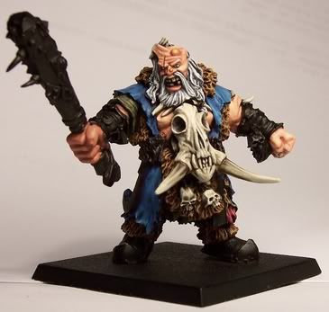
Followers of this blog will no doubt have noticed that I haven't been particularly active over the last 6 months or so. Truth is, I haven't really done much hobby-wise over that time either, so have little to show. I have, however, still been buying the odd miniature or kit here and there - one such miniature, the limited edition "Barbarian Dude".
The Barbarian Dude is a new sculpt by the talented Emanuele Giovagnoni from Raining Frogs Garage. Cast in resin and produced in 2 runs, the figure was strictly limited to only 350 prints. Unfortunately for anyone thinking about picking up a copy, the figure is already completely sold out.
The figure cost 15 euros, plus 3 euros postage and packaging, or about £15 in UK currency.
Packaging
Ok, the boring stuff first so I will keep this fairly short. The figure arrived in a small padded envelope, inside which the figure came wrapped in a few layers of bubble wrap - enough to avoid any transit damage for such a small and lightweight figure.
Underneath all of the protective packaging the figure comes in a small resealable bag with a numbered card with an image of the assembled figure.
First Thoughts
The first thing that struck me about this figure was the similarity in style and appearance to the Vorag barbarian models sculpted by the master of musculature, Jacques-Alexandre Gillois for the now defunct Ilyad Games.
The Vorag were highly popular sculpts when they were available. Unfortunately they too can no longer be purchased and are rarer than hens teeth on eBay and the usual OOP figure buying sources.
The Vorag shaman is probably amongst my "favourite figures I've never owned" - if you have one you want rid of, let me know in the comments! :)
The Barbarian Dude clearly shares a lot of design cues with the Vorag, namely the musculature, fur boots and spiral metal work - not to mention the usual barbarian loincloth, big belt and massive axe.
Emmanuel (or Poupée Canope as he goes by online) also openly admits to being inspired by the artwork of Simon Bisley (also an inspiration for JAG's Vorag), the artist behind the Conan and Slaine comic books.
Conan the Barbarian by Simon Bisley
Contents
The model comes in 4 parts - the main body, the axe, arms and finally the top knot for the hair.
The quality of the cast is truly exceptional! Probably one of the best I have ever seen. There are hardly any mould lines on the figure, even on areas of intricate detail, such as the wrapping on the axe haft, where you would usually expect to have to do some careful clean-up work. This ticks a major box in my book - I hate cleaning up mould lines!
The figure is sculpted in "heroic" 32mm scale, but measures almost 40mm the the top of the hair due to being a big ol' barbarian. The detail on the cast is crisp and clean too, with even the recessed areas being sharp and well defined. The resin also appears to be pretty good quality - less brittle than Forgeworld's.
While I've already stated that the cast quality is amazing, there are still a couple of small areas that need some work due to a little mould slip. I don't imagine it's possible to find a commercially cast miniature that doesn't require some clean-up work though.
Mould Slip
The most notable areas of mould slip are on the under/insides of the legs (highlighted in orange below). Fortunately these areas are quite well hidden anyway and fixing them shouldn't be anything a little putty won't solve.
There is also a little mould slip and a tiny amount of graining on the left hand side of the models torso, at the belt and latissimus dorsi.
While the belt is a little annoying and trickier to fix, it's still far from the worst I have had to fix. Fortunately it's also a pretty small area of the model.
The inside of the arms also have a bit of a mould line/mould slip that will need fixed. Again though, not a very visible part of the model. Julien Casses found a similar issue with both copies of the cast he received (he was smart enough to buy two before they sold out - wish I'd thought of that as they will no doubt be worth a pretty penny!).
I did notice that there was a bit of an air bubble on the joint...socket...bit (?!) of the right arm that has meant a little bit of filling will be required to strengthen the banding on the arm at this point which has become a little thin. There is also a mould vent point on the arm just below the banding at this point that will need trimmed.
It's worth bearing in mind that while it might seem like there are a number of issues with this model, I am really nit-picking with the issues I've highlighted in this review. As I have already said, this is definitely amongst the best cast miniatures I have purchased, but no miniature comes without a little clean-up.
For £15, I would definitely say this miniature was worth the money and I am very much looking forward to painting him.
Barbarian Dude
Reviewed by CMDante on
Overall Rating: 5/
5
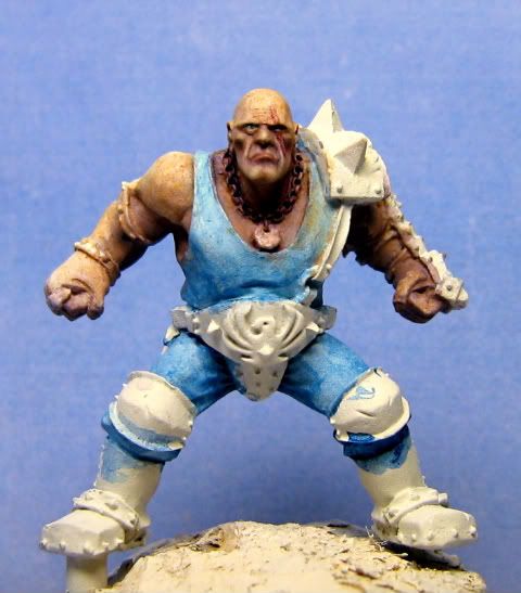
I have had the fantastic Brian Nelson plastic Nurgle Lord model from Games Workshop sitting on my painting desk for a few months now, partially assembled and waiting for some attention. The problem was, I knew I wanted to convert him - I can't seem to not convert a model these days - but I didn't know what I wanted to do to him and was hesitant to start cutting him up only to regret it.
Anyway, I had some extra time off from work over the Easter weekend last week and I decided to just sit down and work on some models since I had been in a bit of a lull of late. Shrugging off my earlier hesitations, I decided to start working on the Nurgle Lord figure, despite the absence of a clear idea in my head for how the finished piece should look.
While this is quite unusual for me, the process was quite liberating as I wasn't frustrating myself by trying to work too precisely towards an image in my head.
The end result of a few hours work is what you can see below. I clipped off the horns on the shoulder pad and turned them into disease ridden pustules. I added the crow from the Empire General kit, with a little conversion and tidying up, to return some height and attention to the area and also to create some visual lines through what is otherwise quite a 2D pose.
The head received the most sculpting work to create a hideous face, half covered by a helmet with horn bursting through. The rest of the work composed of adding some rivet detail to flat armour plates (rivets always catch rust well so they would help work some contrast in when it came time to paint) and to tidy up areas of soft detail due to the limitations of plastic casting.
All in all, I am pretty pleased with how he has turned out. While not radically different from the original sculpt (I don't think he needed to be anyway - the original is was an instant classic) he is different enough to be unique, which is what I was going for.
I used a mix of ProCreate and Milliput putties (about 50:50) for the face/helmet sculpting, ProCreate on its own for the horn and Milliput for the armour plate fixes.
All in, not bad for a few hours work I think. I will be painting him up in the coming weeks. I picked up a few of the new GW paints to test them out so will try to provide my thoughts on these two in the next few posts as I work on the model.
As usual, feel free to let me know your thoughts in the comments below.
It's been a little quiet on the blog front over the last 3 weeks or so but I have found snatches of time here and there to progress this project. I'm finally at the end of the sculpting and converting stage (excluding a little bit of gluing) so painting and work on the base is up next.
The arm holding the weapon and the cape were probably two of the things I was kind of dreading having to do, but in the end they were actually a lot of fun to do and turned out quite well.
All in all I am very pleased with how he has turned out and I'm looking forward to slapping some paint on him. I've learned a lot during the converting and sculpting process on this figure, including finding a putty mix that I am really enjoying working with - hopefully this will carry over onto future figures too.
Feel free to let me know what you think, or any questions in the comments below.
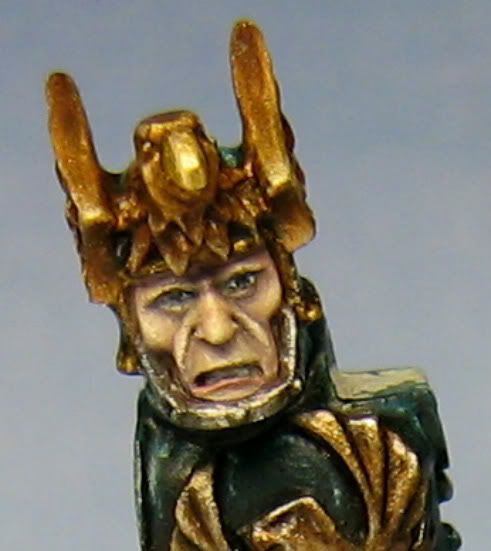
Finally got around to finishing this figure - first of the year! A nice sculpt but with a few headaches due to typical Forgeworld cast issues (though much improved over the quality from about 3 yeard ago!). The jump pack in particular had a few ugly areas.
The other area I always find a little frustrating is the round metal dimples on the jump pack - painting metal over white is always an issue!
The paintjob is a bit predictable being fairly similar to the one on the Forgeworld site with the exception of the fully gold hammer and the gold raven on the jump pack top. I felt that it was important to emphasise his captain status with plenty of bling.
The base was a bit of an after-thought on this figure as I really just wanted to get him finish. It turned out ok, but there are areas I think could be improved. Still, I think the sand/dirt colour contrasts the armour quite nicely.
I spent the afternoon doing some early work on the first test model for the upcoming Tanith project too. I've settled on putting together (at least some) of the Gereon mission team.
can i ask what kind of brush you use for the close detail? i have the fine detail brush from citadel since it was the smallest one i could find but is that good enough for doing eyes?
It's a good question as a lot of folks struggle to find a brush that's right for them for doing fine detail work such as eyes, leading some to simply leave the eyes of a model un-painted, or resulting in the "thousand yard stare" of an intensely frayed veteran who's seen one too many armour saves come up 1!
If your having similar problems yourself, don't feel down, everyone starts out much like this, it's simply a case of developing good brush control, through practice, to enable you to get the paint in the right place, and using the right equipment for the job.
Personally, I use W&N series 7 brushes for my detail work (size 000 for eyes, size 00 for most other stuff). W&N brushes are considered some of the top brushes and really are deserving of this title as they maintain a perfect point (with proper care) for a long time (I've had mine since January and they're still like new).
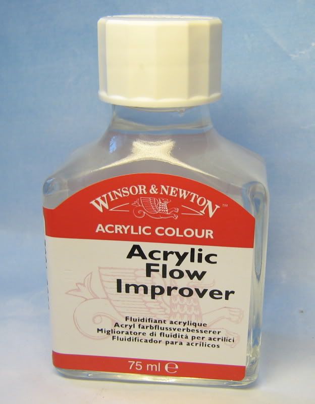
For eyes, the other thing I have found is that white and black are both colours that can dry out quickly on the brush when in the small quantities required for such small detail work. Therefore, for the last few months I've been using W&N Flow Improver. This stuff basically makes the paint go on so much easier and with so much more control, without diluting the strength of the colour (like water would), and without making the colour take forever to dry (like drying retarder would).
It's also good stuff for any awkward colours and for freehand. Best of all, you get a pretty big bottle which lasts a long time.....unless you spill some of it on your desk a day after getting it (doh!:o).
When I paint eyes, I find as large a part of the process as any is simple patience. Regularly I will rework the eyes 2 to 3 times before I have them just right.
Also, you will want to think about at what stage you paint them in relation to the areas around them, most commonly the rest of the skin on the face, but sometimes masks, helmets etc can get pretty close, within "splash range" (where you might slip and fudge up the adjoining area). Typically, I like to paint the eyes in after I have reached a mid point in painting the flesh of the face. This way, if you do mess up a bit when putting the colours for the eyes in, you don't have as many layers of colour to re-do.
The process I use for painting eyes is:
Paint the sockets with a very dark brown, almost black, but not totally black as this can look a little unrealistic. The hint of brown takes the edge off a bit and makes them fit better with the flesh of the face. For me, this will typically be a mix of GW Scorched Brown and Vallejo Black, but any mix to make an almost black brown will be fine. Think of this step as eventually representing the eye lashes of the eye.
Paint the whites of the eyes in using an off white, being careful to leave a thin line of the above step around the edges of the socket. I use P3 Menoth White highlight (a creamy white), but again, any will suffice. The reason for using off white is for the same reason we didn't use pure black above. Real eyes aren't brilliant white anyway so it adds to the realism.You can play about here if you are so inclined, and depending on the model, to get different expressions. By leaving more of a top "eye lash" line on a female model, you can simulate make up and a sultry appearance.
Finally, add the pupils with a very dark grey, again, almost but not quite black. For this I use Vallejo Dark Grey mixed with a tiny amount of Vallejo Black. When applying, try to keep the pupils equally positioned on the eyes, both pointing in the same direction. To make the eyes really pop, I like to add a tiny highlight to the pupils (if possible depending on the figure) with a tiny dot of a slightly lighter grey (normally Dark Grey on it's own, sometimes with a little Basalt Grey mixed in).
That's pretty much it! Again, don't be afraid to go back and re-work things to get them right. I normally find it takes a few attempts to get things like both the pupils looking equidistant and in the same direction.
As you can no doubt tell from the dodgy pun of the title (sorry!), this post is concerned with the method I use to paint human flesh.
I've received a lot of questions on forums lately asking me about the recipe's and methods I use to paint flesh (specifically caucasian flesh), so I thought rather than reply every time with the same response, I would put together a short (text heavy for the time being - not had a chance to do step by step pics yet) tutorial.
Prep Work
With any painting project, it is always worth doing some good preparation to ensure that you don't make any mistakes etc that you would have to correct later, or that could frustrate you/ruin the look of the finished figure.
The first thing worth doing when painting flesh is to look at reference pictures. Skin tone's vary from person to person, regions and climates. The picture below is a perfect example of this - notice that even among caucasian people, the tones can be quite different.
Paint Selection
While most paint manufacturors make "flesh" colours, and these can be good for painting armies in a quick fashion, often they are quite orangey, or pinkish in appearance, leading to an un-natural looking figure (for example the skin on my old ogre hunter below (2004), while nice enough, doesn't look very realistically human).
Therefore, for my current method of painting flesh, I like to look to other, more realistic looking tones for skin.
Base Colour
My current colour of choice as a base for all caucasian flesh is Games Workshop's Dheneb Stone paint from their foundation range. A nice "off-tan" colour, it also has the added benefits of great coverage, thins well and takes paint and washes over it very well.
Shades
The colours used for shading flesh go a long way to helping define the mood, character and overall look of your finished figure. Greener shades can be used to create sickly looking characters, while red and pink shades can help define a healthy, "softer" looking character.
While the shades I use for painting flesh are dependent upon the figure for the reasons outlined above, most commonly I use a mix of Vallejo Warlock Purple from their Game Colour range, and Charadon Granite, again from Games Workshop's foundation range, along with a little Dheneb Stone mixed in. The figure in the picture below has had the above mix applied over a Dheneb Stone base.
Toning
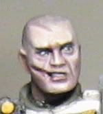
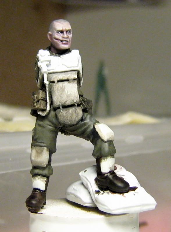
Beyond simply shading the flesh on your figure, it's also a good idea to add some toning in order to add a bit more interest to the skin. On the Cadian stormtrooper I'm working on at the moment for example (pictured at the start of this post), I have added some toning to the face using a mix of Baal Red and Devlan Mud washes from Games Workshop mixed with a little Vallejo Matt Medium (to remove the shine). The reason for this is that the figure will be set in a winter scene and I wanted a cold look to the face, hence the pink cheeks.
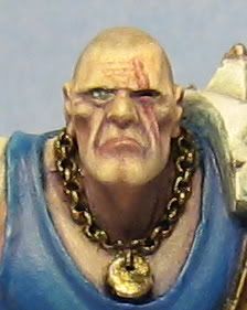
While this isn't an immediately noticeable effect that can be picked out on it's own, it adds considerably to the overall appearance of the mini. On Griff Oberwald's face (below) for example, toning was applied using a darker purpleish tone to make him appear aged.
Highlights
For highlights, as always it is simply a case of lightening the base colour. In this case, Dheneb Stone is first re-applied in a few thin coats to build a base for the highlights. Following this, P3 Menoth White is added to Dheneb Stone in increasing quantities for a few stages of highlighting. There is no definitive placements for highlights as it very much depends upon the figure, look you are aiming for etc, however as a general rule, the areas to focus upon are the brow, tip of the nose, tops of the cheeks and the tip of the chin.
Application In order to replicate the translucent qualities of real human skin, the shades and highlights are best applied in very thin layers. Thin the paint until it is almost was like in consistency, get some on your brush, then dab the side of the brush lightly against a tissue a few times until most of the moisture is removed and then apply.
Hopefully that covers the main thrust of how I approach painting flesh. As with anything, there are many approaches that can be taken, this is the one that works for me, but you might find something else more suitable to your own style. Above all, don't be afraid to experiment with colours, tones and techniques to get the effect you desire.
Would love to hear your comments on your own experimentation and techniques for painting flesh.


+-+CMDante.png)


+-+CMDante.png)

+-+CMDante.png)
+-+CMDante.png)
+-+CMDante.png)
+-+CMDante.png)